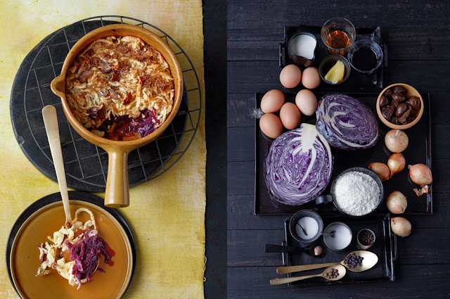
2
3
4
5
colourconcept + styling: dietlind wolf
photo: julia hoersch
food : michael wolken
in print : essen und trinken 11 / 2012
i would love to get you opinion,
two doublepages 2+3 and 4+5 are the same dish but different styling,
which one do you like more,
the puree on black or yellow plate?
and the soup on black or yellow fond?


Adoro su trabajo. Siempre accedo a sus imágenes con ilusión, sabiendo que voy a disfrutar con la poesia que ofrecen sus objetos, los olores, los colores... Gracias por este disfrute para los sentidos y por compartirlo. Un abrazo.
ReplyDeleteI think page no 2 looks better then 3. The black plate "ties" the dish together and lets the colours look more rich and appetising.
ReplyDeleteAnd I like page number 4 as opposed to number 5. The yellow background mat sets the black pots apart. Although in number 5 the focal point is definitely on the soup as the most outstanding colour.
Nadine
thank you nadine, your opinion mirrors exactly what i would have printed, ..but tastes vary .. in print were nr. 3 and 5
DeleteI like the soup on yellow but the puree on black. But dear Dietlind, looking at your work makes me happy. Thank you. I visit once every 2-3 months and soak in the beauty.
ReplyDelete